Interacting with the User
A program that just runs all by itself can be a useful thing. However, a program that interacts with the user is often much more interesting and flexible because it may not do the same thing every time, depending on the choices that the user makes. There are Logo commands that let you get information from the user through the Listener panel. Look up READ, READCHAR, READWORD and READLIST, for example.
Let it Talk!
Would you like Logo to talk to you? No problem! Try the SAY command to make Logo talk to you. For example, try this:
SAY [HELLO THERE!]
Or would you like Logo to tell you hi? Then add the global variable :USERNAME to the greeting; that variable contains the name that you used when you bought Logo.
SAY SE "HELLO, :USERNAME
SAY is almost the same as the PRINT command. Instead of printing something to the Listener, you make Logo say whatever it should say.
Most computers support multiple voices. A voice can be male or female, or even someone from a different country. The menu item “Select Voice” in the Tools menu lets you select a different voice.
Actually, selecting different voices can be a lot of fun! If you use the Chrome browser, you will see quite a few Google voices. Try, for example, to select “Google Deutsch”, and have Logo say the following:
SAY [HELLO, THERE. HOW ARE YOU TODAY?]
And the voice will say this sentence, but with a terrible German accent!
Try other voices, like Google Italiano. The results are often hilarious! Some voices cannot even speak english, and fall back to spelling out each word.
Controls
 Graphical controls are used to create a
Graphical User Interface (or GUI presentation) for an application
program. The idea of “control” is from two points of view: (1) GUI
controls help a program control the actions of a user by restricting
choices and limiting selections to those defined and understood by the
application to prevent a user from supplying data that does not compute;
and (2) GUI controls allow users to pick and choose which options they
want when they want them - controls give users a sense of power over the
application instead of being controlled by it.
Graphical controls are used to create a
Graphical User Interface (or GUI presentation) for an application
program. The idea of “control” is from two points of view: (1) GUI
controls help a program control the actions of a user by restricting
choices and limiting selections to those defined and understood by the
application to prevent a user from supplying data that does not compute;
and (2) GUI controls allow users to pick and choose which options they
want when they want them - controls give users a sense of power over the
application instead of being controlled by it.
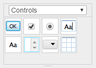
Several different controls are available in the Controls panel of the Toolbox.
Controls are graphical and they respond to many of the same commands that you use for bitmaps and turtles, but they are not bitmaps or turtles. They cannot draw, for example.
Controls can be dragged from the Controls panel of the Toolbox to the Graphics panel. Each control created in this way is given a name based on its type. For example, open the Controls panel and drag out a button control and drop it on the Graphics panel. Logo displays the message:
BUTTON dropped
When you drag a control to the Graphics panel, some properties are
filled in with default values. For example, the “Click me” label on the
button is actually the value of the button’s TEXT property. Other
controls have different defaults, depending on the control. The
NEW and
DECLARE commands can be used to create
controls. The NEW command creates a control
with a name like the one created by dragging a control from the Toolbox.
The DECLARE command requires that you
choose a name. In either case, the control is placed at the center of
the Graphics panel without the default values that are assigned when you
drag a control from the Toolbox. Type:
NEW "BUTTON
Result: BUTTON.1
To move a control to a new location, hold down the Shift key while you
click and drag on the control. You can also move a control by setting
the POSITION property to a new coordinate point. Type:
PPROP "BUTTON.1 "POSITION [100 100]
Each type of control is a different classification. Type:
ASK EVERY "BUTTON [BACK 50]
You can get rid of a control with the ERASE command. Type:
ERASE "BUTTON.1
Be careful with the CLEARSCREEN and DRAW commands - they erase all of the controls from the Graphics panel. Use CLEAN unless you really want to get rid of the controls.
Chances are, you’ve used every type of control in some application or
other, so you know how they work from the user’s point of view. Now,
you’ll learn what it takes to put them into your own programs. It’s not
difficult - most things are done with manipulations of the property
lists. The most important common properties are NAME, POSITION,
SIZE and RUN. Except for the slider control, TEXT is another
common property but it’s not used in the same way by each control. Some
controls have special properties as well as their own commands.
Button Control
 The button control is typically used to run
something. When you click on a button, you expect something to happen.
Type:
The button control is typically used to run
something. When you click on a button, you expect something to happen.
Type:
PLIST "BUTTON.1
The result is a long list of properties that you can set to affect all aspects of a control. To set a property value, use the PPROP or PPROPS command. Change the following properties to the value shown:
RUN      change to [MOVE]
POSITION change to [140 50]
TEXT     change to Move
PPROPS "BUTTON [TEXT |Move| POSITION [140 50] RUN [MOVE]]
The TEXT property of a button is the label you see on it. It’s a good
idea to use short but meaningful words for labels. By default, a button
is a long rectangle but it doesn’t have to be. When you click on the
button control, the instructions in the RUN property are run as if you
had typed them in the Listener window. Then define the MOVE procedure.
TO MOVE
  FORWARD 100 RIGHT 123
END
Click on the Move button a few times. You should see the turtle move and
turn each time you click on the button. 
Checkbox Control
 The checkbox control is like a switch - it’s
either on or off. Typically, a checkbox gives the user a choice between
two conditions. Drag out a checkbox control and place it next to the
Move button. Change the following properties to the value shown:
The checkbox control is like a switch - it’s
either on or off. Typically, a checkbox gives the user a choice between
two conditions. Drag out a checkbox control and place it next to the
Move button. Change the following properties to the value shown:
RUN      change to [SWITCH.PEN]
POSITION change to [200 50]
TEXT     change to Trail
STATE    change to TRUE
In your program, it’s usually best to have a procedure that outputs the value of a control. A procedure with a meaningful name allows you to think in terms of what a control is for rather than how you have to manipulate it. Define the following procedure:
TO TRAIL?
  OUTPUT GPROP "CHECKBOX "STATE
END
For a checkbox control, the value is from the STATE property. The
TEXT property is just a label. You can put a lot of instructions in
the RUN property of a control, but using a procedure is easier to deal
with, especially if you need to make changes later on. Define the
following procedure:
TO SWITCH.PEN
  IF TRAIL? [PENDOWN] [PENUP]
END
This form of the IF command has two lists of
instructions that may be run, depending on the result of the condition
being tested. In this case, the condition is the output of the TRAIL?
procedure - it outputs either TRUE or FALSE. The first list is run if
the condition is true; the second list is run if the condition is false.
Now, when you click on the Move button, the Trail checkbox will determine whether or not the turtle leaves a trail (or draws lines). The checkmark indicates that a condition has been selected or turned on; removing the checkmark turns off the selection.

Radiobuttons
 The radiobutton control is a simulation of a
mechanical button - like a channel selector on some radios. When you
push on a real radiobutton, it selects a channel. To change channels,
you have to push on a different radiobutton - pushing on the same
radiobutton has no effect. This type of selection is called “mutually
exclusive” in statistics - you can have one or the other, but not both
at the same time.
The radiobutton control is a simulation of a
mechanical button - like a channel selector on some radios. When you
push on a real radiobutton, it selects a channel. To change channels,
you have to push on a different radiobutton - pushing on the same
radiobutton has no effect. This type of selection is called “mutually
exclusive” in statistics - you can have one or the other, but not both
at the same time.
Drag out two rabiobutton controls and place them next to the Trail
checkbox, one above the other. Change the following properties of
RADIOBUTTON:
RUN   change to [CHANGE.COLOR 1]
TEXT  change to Red
Change the following properties of RADIOBUTTON.1:
RUN   change to [CHANGE.COLOR 2]
TEXT  change to Black
Both radiobuttons run the same procedure, but they give it a different
input to identify themselves. The CHANGE.COLOR procedure has to do two
things: turn off the other radiobutton and then change the color of
the turtle’s pen to the requested color. It’s best to turn off the other
button before doing anything else; otherwise, there may be a slight
delay - and you might think your radio is broken. Define the
CHANGE.COLOR procedure:
TO CHANGE.COLOR :BUTTON
  IF :BUTTON = "RADIOBUTTON [TURN.OFF "RADIOBUTTON.1 SETPC "RED]
  IF :BUTTON = "RADIOBUTTON.1 [TURN.OFF "RADIOBUTTON SETPC "BLACK]
END
The TURN.OFF procedure takes a button name as input. It sets the
STATE property to FALSE, which simulates popping the button out.
Define TURN.OFF:
TO TURN.OFF :BUTTON
  PPROP :BUTTON "STATE "FALSE
END

Editbox Control
 The editbox control is for getting information
from users. It’s normally a free-form input which means users can type
whatever they want. You can control this, to some extent, by using the
The editbox control is for getting information
from users. It’s normally a free-form input which means users can type
whatever they want. You can control this, to some extent, by using the
FILTER property. Just put in the characters you consider to be
acceptable. For example, if you want numeric input only, then put the
string of digits 0123456789 in the FILTER property to restrict the
users’ input to just numbers.
A maximum of 1000 characters can be entered into an editbox. You can
control this with the LIMIT property. It can be any number from 1 to
1000.
How will your program know if a user has entered anything in an editbox
control? The MODIFIED property gets set to TRUE whenever the user
types anything into the editbox. It does not get set to FALSE again.
However, your program can set MODIFIED to FALSE after getting the
TEXT value so that it can detect a new entry later on.
Let us set up an edit box. Whenever you type in something and press the
Enter, the turtle will print the
text if “Trail” is checked (the turtle needs to be able to draw). So,
drop an edit box and set its properties:
POSITION change to [164 15]
RUN change to [TT GPROP "EDITBOX "TEXT]

Since user input is (believe it or don’t) a very unreliable way of getting accurate data, be careful about what you expect to get from a user in an editbox control. The user’s name is not likely to cause a problem, but don’t ask a user to enter a command line to run - there’s a good chance your program will stop with an error message.
Statictext (Textbox) Boxes
 The statictext (or textbox) control is
typically used for displaying helpful information for the user, either
as the label for a control or as an instruction panel. Drag out a
statictext control and change the following property:
The statictext (or textbox) control is
typically used for displaying helpful information for the user, either
as the label for a control or as an instruction panel. Drag out a
statictext control and change the following property:
POSITION change to [164 -10]
TEXT     change to Speed
This control will be used as the label for a slider, since it doesn’t have a label of its own.
Sliders
The slider control (also called a scrollbar) is used to get numeric
input from a user. You can control the range of values with the
MINIMUM and MAXIMUM properties to make sure the number you get is
always in the proper range. The arrows at the ends of a slider adjust
the value of the control in small increments, as defined by the
SMALLINC property. The LARGEINC property is used to adjust the
slider value when the user clicks in the areas between the arrows and
the sliding mechanism. The position of the sliding mechanism of a slider
is a visual representation of the control’s value as it relates to the
minimum and maximum values allowed.
The slider does not have TEXT property. You can use a statictext
control as a label. However, you can see the value of the TOOLTIP
property when you put the mouse pointer over a scrollbar. The value of a
scrollbar is the VALUE property. It may not be a whole number, even
though the minimum, maximum and increments are whole numbers, because
the sliding mechanism can be moved to any position between the arrows.
Drag out a slider control, place it under the “Velocity” label, and change the following property:
POSITION  change to [164 -30]
MINIMUM   change to 0.1
MAXIMUM   change to 1
INCREMENT change to 0.1
RUN       change to [CHANGE.SPEED]
This makes the slider produce values between 0.1 and in increments of 0.1. Define the following procedure that outputs the value of the slider:
TO CURRENT.SPEED
  OUTPUT GPROP "SLIDER "VALUE
END
The CHANGE.SPEED procedure will do two things: set the turtle’s speed
to the value of the slider and display the current velocity in the
statictext control. Now, define the CHANGE.SPEED procedure:
TO CHANGE.SPEED
  SETSPEED CURRENT.SPEED
  PPROP "STATICTEXT "TEXT WORD "|Speed | CURRENT.SPEED
END
If you move the slider, you can change the turtle’s speed, and the speed displays in the statictext control.

List Boxes
 Drag a listbox control from the Toolbox and
place it under the scrollbar control. The listbox control is actually a
table of text items.
Drag a listbox control from the Toolbox and
place it under the scrollbar control. The listbox control is actually a
table of text items.
The APPEND command adds a new item to the end of the table. Type:
ASK “LISTBOX [APPEND “HOME] Result: 0
APPEND is one of several special commands that are used by the listbox
and popup controls. It appends its input to the listbox.
The items of a listbox are indexed by numbers. Index number 0 is for the first item in the table, 1 for the second item and so on.
The output of APPEND is the index number of the item that was added.
If you don’t need to use it, you should
IGNORE it.
Instead of APPEND, you can simply access the items via the ITEMS
property. Let us use the listbox to set the background to different
colors. Change the following properties:
POSITION change to [300 -10]
SIZE     change to [140 80]
ITEMS    change to [LIGHTYELLOW GOLD SANDYBROWN CHOCOLATE WHITE]
RUN      change to [SET.BACKGROUND]
Curious about the color names? See the Logo Colors page for a complete list of color names!
Define the SET.BACKGROUND procedure:
TO SET.BACKGROUND
  SETBG GPROP "LISTBOX "TEXT
END
Thankfully, the TEXT property of a list box contains the text of the
selected item. You can also select an item by setting TEXT to the
item’s text.
When you change the background color, you may notice that the checkbox
and radiobuttons have a white background. You can change this by setting
their background to a transparent white. If you remember the section
about transparent colors, a color is a four-element list, where
the last element is the transparency level, which is a number between 0
and 1. 0 is fully transparent, while 1 is fully opaque. So, change the
following setting at the CHECKBOX, RADIOBUTTON and RADIOBUTTON.1
controls:
BACKGROUND change to [255 255 255 0]

Popups
 A popup control is just like a listbox, but it
occupies much less space than a listbox, because ti displays its
contents only when click the control. Only the currently selected item
is shown. When you click on a popup control, a list of items appears (or
pops up) so you can make a selection. The item you select is then
duplicated in the top of the control and the list disappears.
A popup control is just like a listbox, but it
occupies much less space than a listbox, because ti displays its
contents only when click the control. Only the currently selected item
is shown. When you click on a popup control, a list of items appears (or
pops up) so you can make a selection. The item you select is then
duplicated in the top of the control and the list disappears.
File Choosers
 The FILECHOOSER control lets you select a file
from disk. You can set its text with the
The FILECHOOSER control lets you select a file
from disk. You can set its text with the TEXT property, and you can set a list
of file extensions or MIME types (these are standardized file types, like for
example image/png for PNG files) to limit the choice of available files. Simply
create a list, and set the TYPES
property to that list.
After selecting a file, the control’s FILE property contains the file. This looks just like the file name, but the value also contains additional file information, and can be fed into all Logo commands that load a file, like e.g. LOAD.
Here is an example:
TO SETUP.FILE.LOADER
    DECLARE "FILECHOOSER "LOADER
    PPROP "LOADER "TYPES [LOGO LGO] ; limit the selection to Logo files
    PPROP "LOADER "RUN [LOAD GPROP "LOADER "FILE] ; load the selected file
END
Videos
 The VIDEO control lets you display a video from
a streaming site in your Graphics panel. It has a
The VIDEO control lets you display a video from
a streaming site in your Graphics panel. It has a LINK property that
accepts a special link. Please note that web links are case sensitive!
Enter the DRAW command to start over, and drag a Webpage control on screen.
The LINK property recognizes several video streaming services as
special URLs. Often, the URLs to view a video are complex beasts to type
in. If you know the ID of your video, you can use the name of the video
service, a colon, and the ID of that video. All video sites reference a
video by an ID. At Vimeo, it is a number, at YouTUbe, it is a string of
several characters, etc.
An example: If you click a YouTube video, its URL (displayed in the browser’s address bar could be, for example:
https://www.youtube.com/watch?v=ZJaSQgsDQ1w
The text “ZJaSQgsDQ1w” is the video ID. To watch this video, use this command (assuming that the name of your control is VIDEO):
PPROP "VIDEO"LINK "|youtube:ZJaSQgsDQ1w|
The LINK property recognizes these video service names: vimeo,
ustream, youtube, viddler, slideshare, dailymotion, bambuser, metacafe,
bliptv, break, msoffice, archiveorg, and niconico.
Let’s have some fun and watch the launch of a space shuttle:
PPROP "VIDEO"LINK "|youtube:xIoRWIgzvbM|

Web Cameras
 Almost every modern laptop has a webcam built
in; your smartphone or your table most often have two cameras, one
front-facing for your selfies, and one to take pictures with.
Almost every modern laptop has a webcam built
in; your smartphone or your table most often have two cameras, one
front-facing for your selfies, and one to take pictures with.
Wouldn’t it be cool to display a camera feed on your Logo screen?
The WEBCAM control does exactly that. It displays the feed of a webcam. Drag and drop a WEBCAM control to your Graphics panel, and it will display the feed from whatever camera it finds at your computer.
If you have more than one camera attached, you can select the camera to display by setting the control’s CAMERA value to a number, or to the beginning of the camera’s name. Often, webcams have long and weird names that are hard to type in. To find out the names of the cameras attached to your computer, issue this command:
GPROP "WEBCAM "CAMERAS
The CAMERAS* property outputs a list of webcam names. If you, for
example, have an Easi-Scope attached to your PC, its name would be “USB
Microscope”. The list of your cameras could, for example, be:
GPROP “WEBCAM “CAMERAS Result: [|FaceTime HD Camera| |USB Microscope|]
Instead of having to type in the entire name of the Easi-Scope, you could easily switch to that camera with:
PPROP "WEBPAGE "CAMERA "USB
Please remember that the comparison is not case sensitive, and that Logo activates the first camera in the list that matches the name that you supplied.
Alternatively, use the item number for the list entry, which would be 2 in the above example:
PPROP "WEBCAM "CAMERA 2
The WEBCAM control has a few more properties; please check the Webcam documentation for details.

On mobile devices, Logo only recognizes the cameras MAIN and FRONT.
Web Pages
 The WEBPAGE control lets you display a web
page in your Graphics panel. Please note that many websites like e.g.
Google do not allow their contents to be displayed inside an embedded
control; in that case, the control remains blank if you load the page.
It has a
The WEBPAGE control lets you display a web
page in your Graphics panel. Please note that many websites like e.g.
Google do not allow their contents to be displayed inside an embedded
control; in that case, the control remains blank if you load the page.
It has a LINK property that accepts a web link (a URL). Please note
that web links are case sensitive!
Enter the DRAW command to start over, and
drag a Webpage control on screen. Then set its LINK property to, say,
this page:
PPROP "WEBPAGE "LINK "|https://resources.terrapinlogo.com/weblogo/manual/controls|

The Trouble with Placing Controls
After you’ve dropped a control, it is up to you to fine-tune its position and size to make your control panel look good. This can be a tedious experience. Thankfully, Logo offers yet another control, the Grid control. This control offers a grid where you can place your controls, and Logo takes care of the positioning of the grid elements.
Also, you may want to keep controls at a certain place on the Graphics panel, even when it resized. Logo can help you here, too, with a technique called anchoring. Using anchoring, you can decide that a control, for example, stays in the lower right corner of the Graphics panel regardless of its size.
These and more hints are covered in the next chapter.